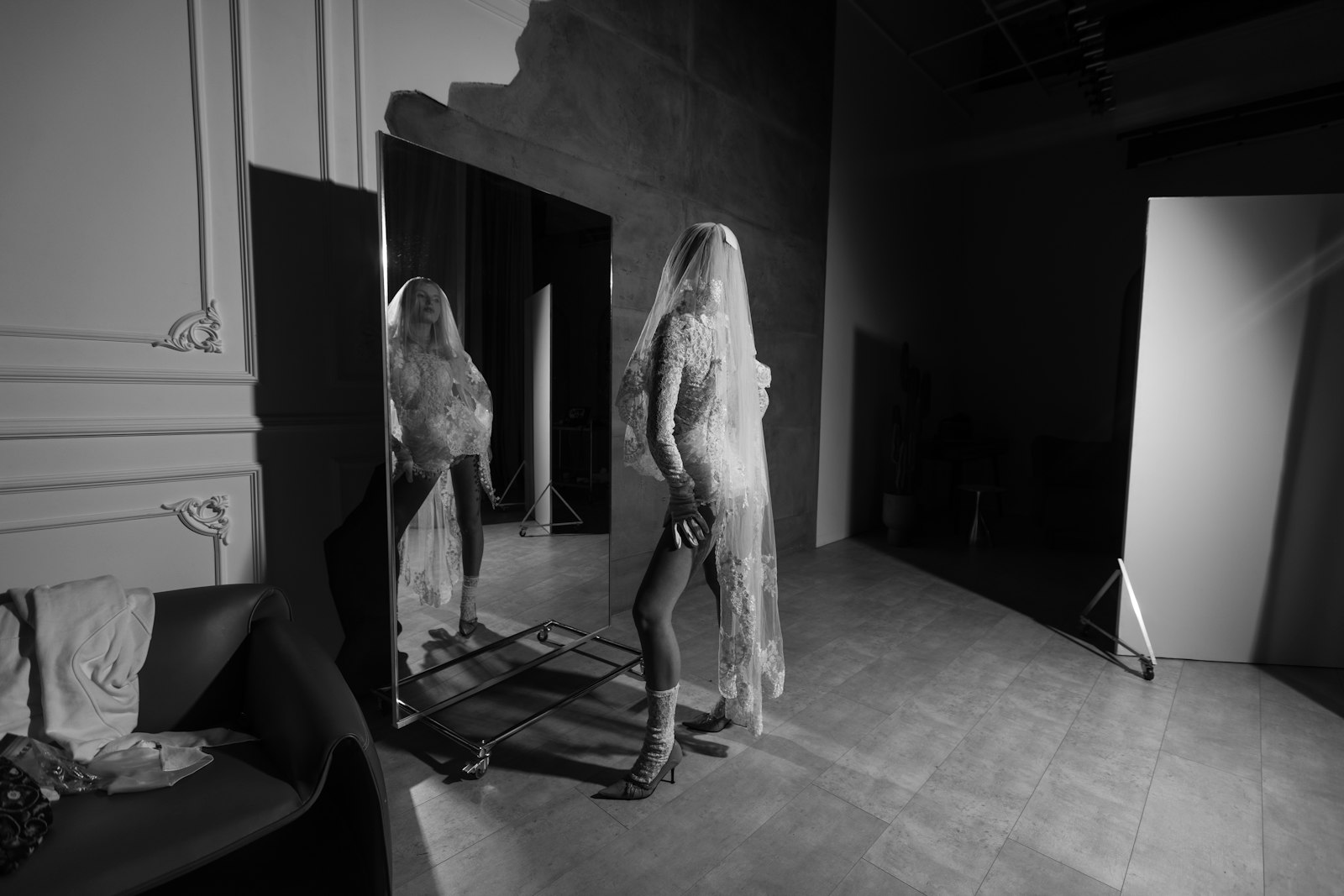
A comp card — called a sedcard across most of Europe, and a zed card by a handful of older agencies — is one printed card, typically 5.5 x 8.5 inches in the United States or A5 in Europe, carrying a single image on the front, three or four on the back, and a short block of your measurements. That is the entire object. It is not a portfolio and it is not a resume. It is the thing a client keeps on the desk after you have walked out of the room, and it has exactly two jobs: remind them what you look like, and confirm that you fit the clothes. Every decision below follows from those two jobs.
New models tend to over-build the card and under-build the images — a third row of photos, a logo, a headshot that is a year old. Casting people flip through a stack of these in minutes. The card that survives is the one where a stranger can identify you at arm’s length and read your height without squinting.
Comp card, digitals, and portfolio are three different objects
These get conflated constantly, and mixing them up is why so many cards look wrong. Digitals (also called polaroids, though nobody uses instant film anymore) are unretouched, no-makeup, plain-background shots in fitted clothing, updated every few months, so an agent can see your current unstyled reality. Your book is the deep proof — fifteen to twenty-five images showing what you do with a photographer, a stylist, and a concept, which is a separate craft we cover in our breakdown of the photos a portfolio actually needs.
The comp card sits between them: a printed summary of the book, in a format that fits a pocket and a pin board. Digitals prove you have not changed. The book proves you can work. The card is the reminder that gets you recalled a week later, when the client is staring at eleven similar faces trying to remember which one moved well.
The front: one image, your name, and restraint
The front is one photograph, bled to all four edges, with your name set over it. No border, no white margin, no drop shadow. A frame around the image shrinks the face and reads as amateur immediately.
The image should be a close headshot or a tight beauty shot where bone structure, eyes, and skin are legible. Direct eye contact beats a downward gaze, because the card is read at speed. Commercial talent should smile here and mean it; for editorial and runway a quieter expression tends to serve better — a market question, not a rule, so study how signed talent are presented on the rosters of the agencies you plan to approach before you commit.
Your name goes in a clean sans-serif, large enough to read across a table. If you are signed, the agency logo goes where their template puts it — ask for the template rather than inventing one, because most agencies have a house layout and will reprint anything that deviates from it. If you are freelance, the front carries your name alone and a single booking contact line goes on the back.
The back: four images that close gaps, not four versions of one look
Four is the working number. Three reads confident. Five fits on an A5 back but gets cramped, and a cramped image dies at thumbnail size. The point is not to show four good photographs — it is to close four gaps in what the client cannot yet see.
- A full-length body shot. Swim or lingerie for fashion markets, fitted clothing if you do not shoot swim. This answers the fit question. Skip it and the client books you blind, which mostly means they will not.
- A commercial or lifestyle frame. Warm, natural, simply clothed. This is what sells catalogue, e-commerce, and advertising — the jobs that pay rent.
- An editorial or attitude frame. Stronger styling, more tension, evidence you can carry a concept rather than just stand inside it.
- A movement or profile frame. Something in motion, or a clean side angle. Casting directors want to know your face holds up from more than one degree of rotation.
Avoid heavy props, group shots, anything where the stylist’s dress is more memorable than you, and anything retouched so hard that the person in the picture is not the person walking through the door. Cleaning up temporary blemishes is normal. Removing freckles, moles, a gap in your teeth, or the shape of your nose is self-sabotage — those are the features that make you bookable, and the client sees the real version at the fitting. To calibrate an honest image set, browse a spread of working model profiles and notice how little post-production the good ones carry.
The stats block: units, honesty, and what nobody needs to know
Keep it to one tidy column or a two-line strip. For women the standard set is height, bust, waist, hips, dress size, shoe size, hair colour, eye colour. For men: height, chest, waist, inseam, suit size, shirt or neck and sleeve, shoe, hair, eyes. That is all. Age, weight, and star sign do not belong on a comp card; weight in particular is not a casting variable, and listing it invites the wrong conversation.
Units follow the market, not your habit — centimetres for Europe and most of Asia, inches for the United States. If you work across both, print two runs rather than cluttering the card with conversions, or set metric large and imperial smaller beneath it, never side by side in the same weight.
Then the part people ignore: the numbers get verified. A tape measure appears at fittings and at agency check-ins. Rounding your height up by two centimetres does not win the job you were too short for; it wins a wasted trip, a booker who now distrusts your card, and a client who remembers the name. Print what is true this month, and reprint when it stops being true — which is an argument for modest print runs.
Comp card size: exact dimensions in inches, millimetres, and pixels
The trim size is fixed by market — 5.5 × 8.5 inches in the United States, A5 (148 × 210 mm) across Europe — but the numbers that actually decide whether a card prints cleanly are the ones almost no guide states: the pixel dimensions, the bleed, and the safe margin. Set your canvas to these before you place a single image.
| Spec | US — 5.5 × 8.5 in | Europe — A5 |
|---|---|---|
| Trim size | 5.5 × 8.5 in (139.7 × 215.9 mm) | 148 × 210 mm (5.83 × 8.27 in) |
| Canvas @ 300 dpi | 1650 × 2550 px | 1748 × 2480 px |
| With 3 mm (0.125 in) bleed | 1725 × 2625 px | 1819 × 2551 px |
| Safe margin (keep text inside) | 5 mm / 0.2 in from every edge | 5 mm from every edge |
| Resolution | 300 dpi minimum | 300 dpi minimum |
| Colour mode | CMYK (not RGB) | CMYK (not RGB) |
| Export | print-ready PDF/X, fonts embedded | print-ready PDF/X, fonts embedded |
| Card stock | 350–400 gsm, matte or silk | 350–400 gsm, matte or silk |
| Orientation | Portrait | Portrait |
The pixel math is just the trim size times the resolution: 5.5 in × 300 = 1650 px wide, 8.5 in × 300 = 2550 px tall. Adding 0.125 in of bleed on all four sides grows each dimension by 0.25 in — 75 px — giving 1725 × 2625 px. Build at the bleed size, keep anything that must not be trimmed (your name, contact line, stats) inside the safe margin, and the printer’s guillotine has room to be a millimetre off without clipping a word or leaving a white sliver.
Print specs and the digital version
Send the printer a CMYK file at 300 dpi with 3mm of bleed on every edge, and check the proof on paper rather than on a screen. Skin tones are where cheap printing fails, and you will not catch it in a PDF preview.
Choose matte or silk stock, roughly the weight of a sturdy postcard. Gloss looks impressive in the hand and terrible under the tungsten-and-daylight mix of a casting room, where it throws glare and holds fingerprints. The card should survive a bag, a rainy walk, and a month pinned to a board.
Print small batches. Hair colour changes, you cut a fringe, you drop a size, an image ages badly — and the four hundred cards in your closet are landfill. The digital version matters as much now: export both sides as one PDF plus two JPGs, keep it small enough to survive an email attachment limit, and name the file with your actual name rather than something like compcard_final_v3. A client searching an inbox six weeks later types your surname, not your version number.
Tailoring the card to a market, and knowing when to reprint
One card does not serve every market. A submission to Tokyo or a commercial e-commerce client rewards warmth and a smile that reaches the eyes. A show package for Paris or Milan rewards stillness, structure, and minimal makeup. Same model, same book, two different image selections.
Reprint when any of these becomes true: your hair has changed in colour or length; two of your four back images no longer resemble you; your measurements have moved by more than a size; or you have shot something genuinely better than what is on the card. Bring a small stack to every casting and hand one over unprompted at the end — a card left behind after a good casting keeps working while you are on the train home.
Frequently asked questions
Do I need a comp card if I do not have an agency yet?
Not on day one. Unsigned talent should spend the money on strong digitals and a few solid images first, because an agency will design your card on its own template the moment it signs you and will not use the one you printed. Build the card yourself only if you are genuinely freelance and handing it to clients directly.
How many photos should be on the back?
Four is the working standard. Three is perfectly acceptable and often looks more assured. Five fits on A5 only if the images are simple and high-contrast; beyond that the card becomes a contact sheet and nothing on it is legible at the size it will actually be viewed.
Should I include my Instagram handle?
Increasingly yes, and many agencies now add it to the template as a matter of course, because a client checking your reach is checking it anyway. Set it small, near the stats block. It is a data point, not a headline.
Can I make the card myself instead of using the agency template?
You can, and your booker will almost certainly reprint it. Agency cards are deliberately uniform so that a client flipping a submission stack reads the talent rather than the layout. Fighting the template signals that you have not understood what the object is for.
Is a printed card still necessary when everything is submitted digitally?
Yes, for anything with a physical casting or fitting. Digital submissions get you into the room; the printed card is what stays behind when twenty people were seen in an afternoon and the decision is made the next morning around a table covered in cards. Where casting is fully remote, the PDF takes over the same role.